Heb je net de stoplichtvisual in Power BI ontdekt en vraag je je af wat de volgende stappen zijn?
Dan ben je hier aan het juiste adres! In onze stap-voor-stap handleiding, ondersteund door onze video tutorials, begeleiden we je bij het instellen en aanpassen van onze visual.
1. Download de visuele
2. Bereid uw gegevens voor
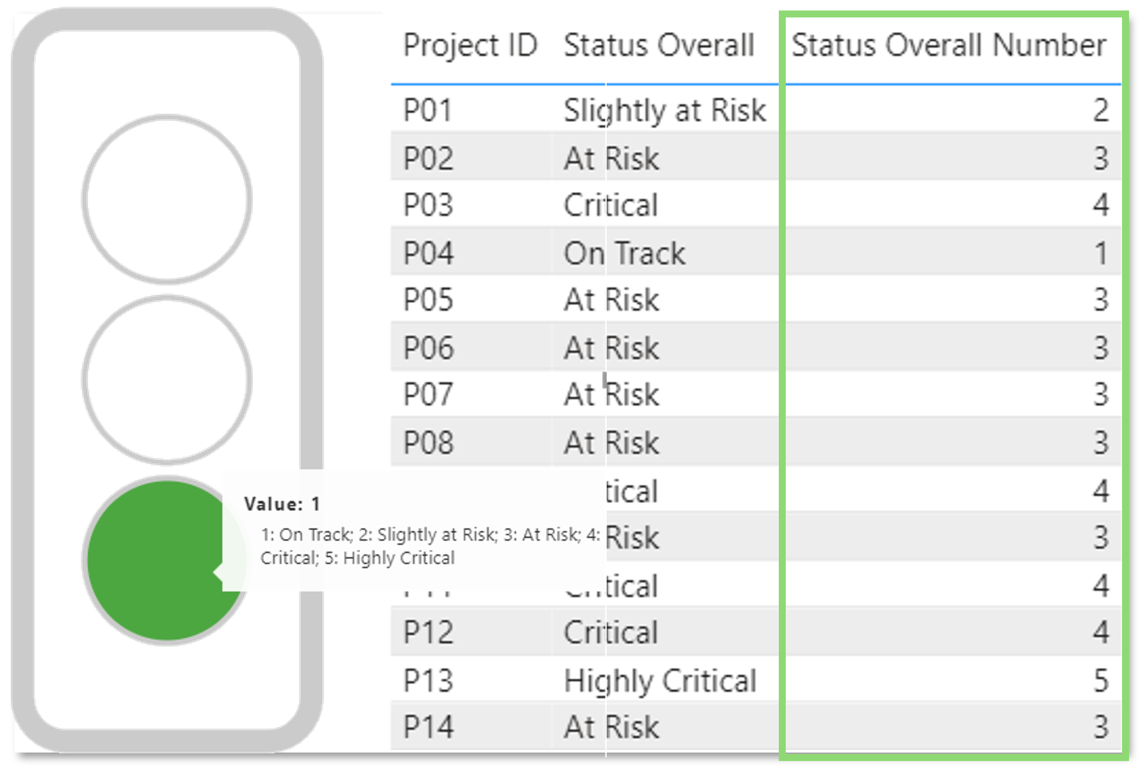
Ons verkeerslicht vereist numerieke waarden, percentages of tijdwaarden (bijv. datum) om bereiken in te stellen voor elke lichtkleur.
Zorg ervoor dat je interessante gegevens aanpast aan een van de ondersteunde gegevensindelingen.
3. Gegevens en licenties importeren
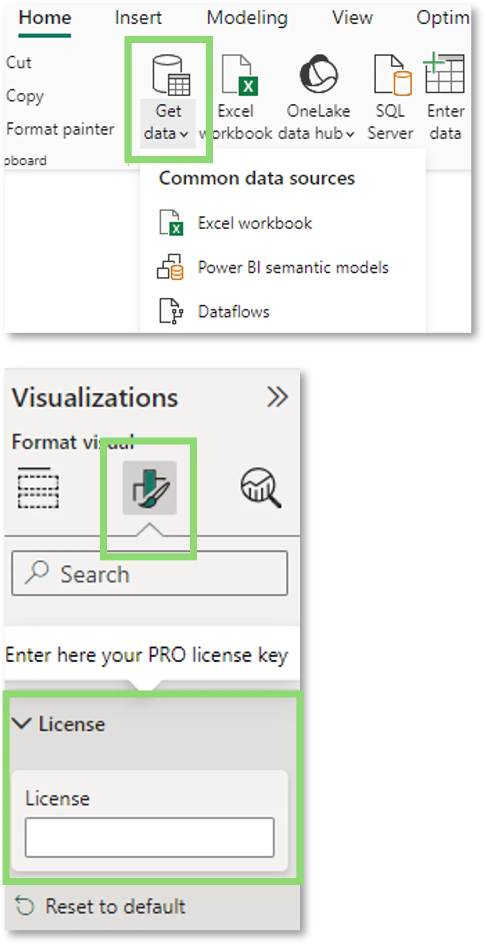
Om uw gegevens te importeren, klikt u op "Gegevens ophalen" in het gegevensvenster en selecteert u uw gegevensbron, bijvoorbeeld een Excel-werkmap.
In een volgende stap selecteer je de visual uit de visualisatielijst om deze toe te voegen aan je Power BI-rapport. Klik nu op "Uw visual opmaken" onder visualisaties en kies de sectie "licentie".
Hier kun je eenvoudig je licentiecode invoeren via CTRL + V.
4. Visuele opstelling
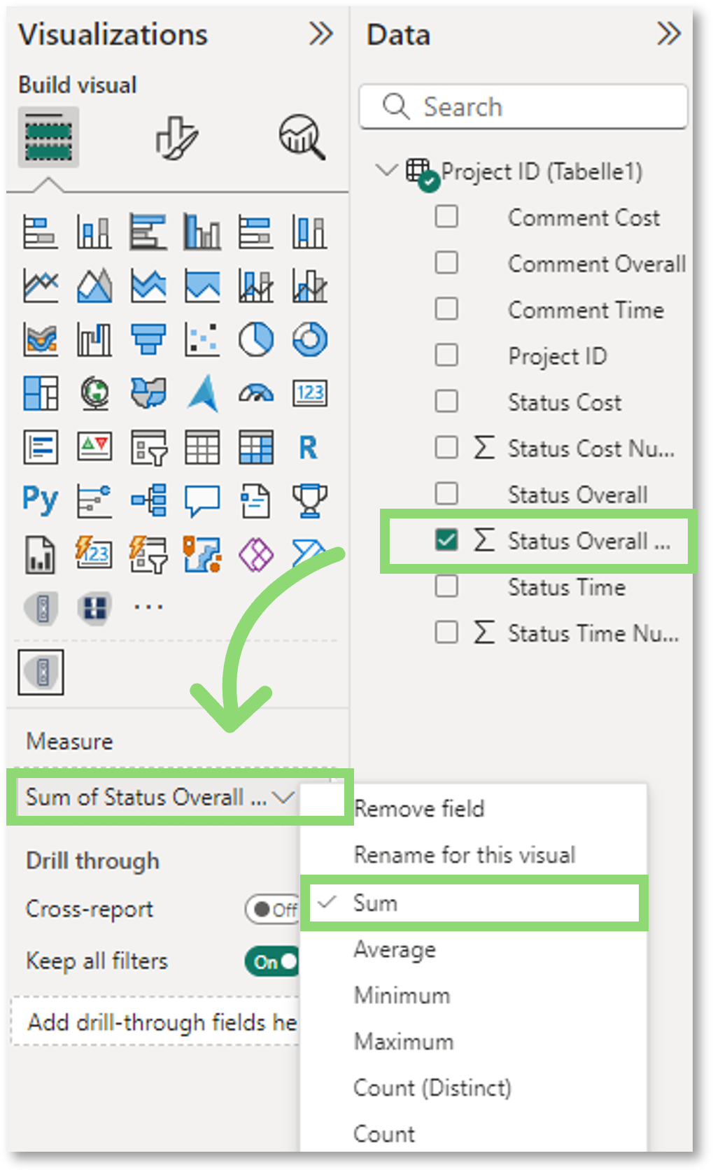
Selecteer de gewenste meting uit het gedeelte "Data" door erop te klikken of deze naar het "Measure"-veld van de visual te slepen.
Optioneel: Door op de dropdown te klikken, kun je de juiste aggregatie voor jouw behoeften kiezen (som, gemiddelde, enz.).
Bij gebruik van tijdformaten moet ervoor worden gezorgd dat het formaat wordt ingesteld volgens het formaat van de geselecteerde maat.
5. Bereiken instellen
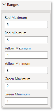
Om je "Traffic Light" visual goed te laten werken, moet je vervolgens de bereiken definiëren voor het weergeven van de lichtkleuren. In het gedeelte "Bereiken" onder "Vorm je visual" kun je minimum- en maximumwaarden voor de betreffende kleur* definiëren.
Wanneer u een datum- of intervalmeting selecteert in de meting-sectie, moet u de bereiken definiëren overeenkomstig de geselecteerde tijdnotatie in de tijdnotatie-sectie.
*Gele minimum en gele maximum is uitgeschakeld als "Tweelichtsysteem" is geselecteerd.
6. Pas je favoriete ontwerp aan
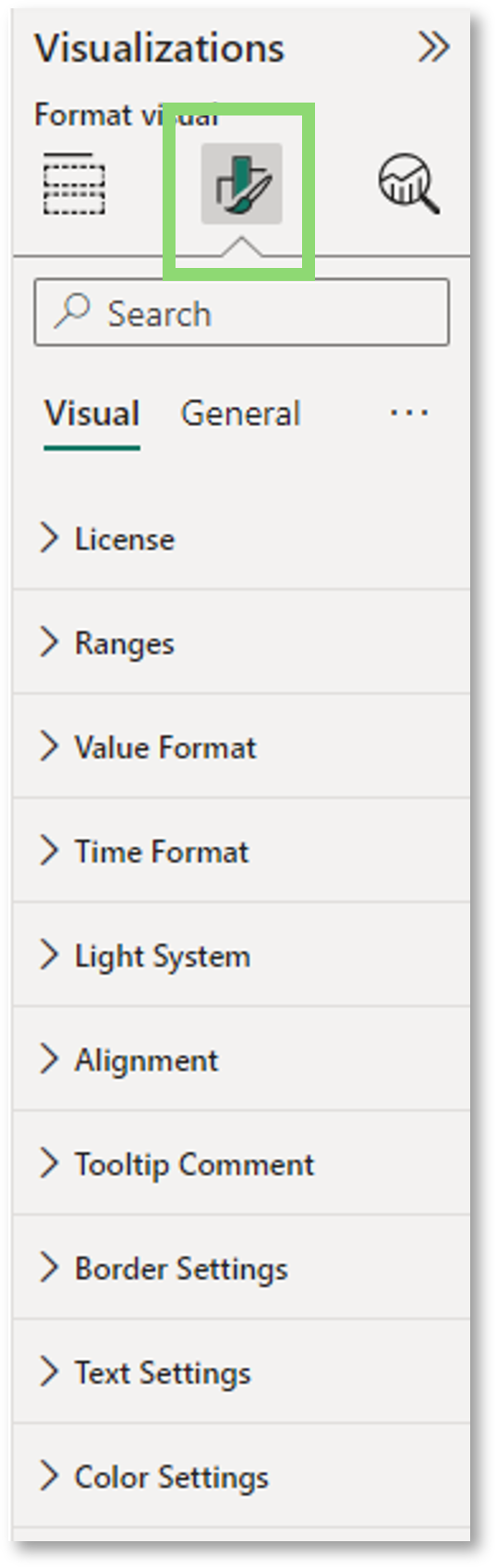
In een laatste stap kunnen we de visual aanpassen aan een individueel ontwerp. Als je onder visualisaties op "Je visual opmaken" klikt, zie je het volgende paneel.
Hier kun je alle opmaakopties aanpassen door je favoriete ontwerp te kiezen.
Instructies voor elke opmaakoptie kun je vinden in onze videohandleiding hierboven.
Perfect, je bent nu klaar om ons verkeerslicht te gebruiken en je rapportage te verbeteren!